Sunday, June 29, 2008

Undecided

I'm at that point where I realize that my idea was much better in my head than on fabric. It's a frustrating feeling under normal circumstances, but now, with no tools, limited fabric and threads, and limited ways to get to sewing machines, tools and other helpful items, I'm feeling very frustrated.


I did the straightforward part of my quilt with rental tools at the Arts and Crafts Center on post, but since I need a car to get there in a reasonable amount of time, and a babysitter to keep an eye on the kids while I'm there, it's not practical anymore (car and hubby are already en-route to Hawaii). For the rest of the piece, I borrowed a friend's machine, which is great for the sewing part, but I'm out a rotary cutter and mat for anything else.

I did a test and felt that with a few changes I was on the right track. Now, I'm pretty much done, but I'm not entirely happy. My sketch is much better than it's stitched version. It's partly because the drawing is just plain better, and partly because the quilting stitches are uneven and wobbly (see blurry photo above).

I have a few ideas for re-doing the quilt, but they require getting to a place with tools and other thread and essentially starting over. My plan is to set it aside for a while (particularly since my neighbor needs her machine back to make a theater costume) and re-address it next week with fresher eyes.

Worst case scenario, I'll try my other idea, but it's possible that that one is better in my head as well.

Saturday, June 28, 2008

Beginning

I played around with a bunch of metallic stuff yesterday. I also flipped through pages and pages of the St. John's Bible and even sketched several compositions. I am going through one of those periods where the idea is just barely bubbling to the surface but it has no real cohesiveness. I know I want to do some kind of illuminated page. But what form will it take? Must I actually use some kind of text? If so, what will it be? A biblical passage? How would I choose? A more contemporary source? What would it be?

I am reminded how much work art can be. The actual hours I spend "in the cloth" are minimal compared to the time it takes to come up with an idea that is worth pursuing. And let's not even talk about the time spent on failed ideas.

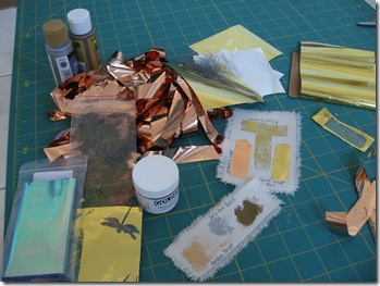
Here is all the metal stuff I dug out of various bins and boxes. I like using the foils and adhering them with Wonder Under.

100_5009

I even swiped a bit of foil from an art kit that Claire received as a gift.

I also found this delightful little assemblage on Etsy.

At this point, I am just asking myself, "Now what?"

Friday, June 27, 2008

Neon

As shown on my blog, earlier in the year I did some fabric painting and then played around with some effects in Photoshop. This particular glowing example caught my attention (click to enlarge):
I even got as far as experimenting with some thread drawing to see if I could achieve a similar effect:
At the time, I concluded that the effect would be lost in a large-scale piece. However, there might be some potential for a 12x12 inch illumination...

Wednesday, June 25, 2008

Oh drat!

I had what I thought was the greatest idea, even had a design in the works, then I had this moment of, ahem, illumination. This is not going to work.

My idea was to use a wonderful quote about light and do a piece in the style of an illuminated manuscript page. A two-fer, using the theme in two ways, as it were. Then it occurred to me that the quote is undoubtedly protected by copyright. It is a song lyric. I don't know why I didn't think of that sooner. It was only as I was thinking about potential possibilities that some or all of these pieces might someday be published that the lightbulb went on.

So drat. I am back in the dark again. (this illumination theme is useful.) I have nothing.

So since I won't be using it for my challenge piece, I guess I can, at the least, share this lovely thought.

"Ring the bells that still can ring
Forget your perfect offering
There is a crack, a crack in everything
That's how the light gets in."
Leonard Cohen, Anthem

Monday, June 23, 2008

Tack

Tack.
That is all I can think of. I read all your posts on beautiful buddhist mediations, illuminated manuscripts and cross cultural celebrations and all I can think about is Blackpool.
Really I want to work with the idea of Eureka! and Achimedes in his bath.
But all I can think about is Blackpool illuminations
So I think I will just have to go with it. But be warned. I am actually beginnng to understand why manufacturers make neon thread. Plus, I am thinking emebllishments the tack of which you have never seen before.
You may wish to use the poll function on our yahoo group to nominate someone to make a reserve quilt for the mosaic!

Friday, June 20, 2008

Lantern Parade

Lismore is too far away but I would love to see their Lantern Parade tonight. A quick Google search shows images from lantern festivals around the world. I found this photo from the 2006 Taipei Lantern Festival on Wikimedia Commons - a database of royalty free images.

Monday, June 16, 2008

Meditation

To me, Brenda's theme "Illumination" immediately said buddhism, meditation, awareness,...
Today, I carved a couple of printing blocks.

I've also been manipulating some of my new pictures on the computer. More about this on my blog.

In the spotlight

While I have been away at the Sydney Quilt Show, it's been been fascinating to read the other posts about the theme of illumination and ideas that are developing. I must confess that, despite putting forward the theme, my own ideas are very embryonic and follow many different strands including moonlight; sunrise; theatre lights; street lights and neon lights. I was intrigued to see that the Martin Scorsese documentary on the Rolling Stones is called "Shine A Light" so maybe that's another source of inspiration...

Saturday, June 14, 2008

Eastern Illumination

I have discarded the idea of abstraction in favor of the concept of eastern illumination or enlightenment. I will be the first to admit I don't know a lot about the religion, and I know there are several versions of it, but I like the idea of working towards peace within oneself.

Hongzhi Zhengjue
Hongzhi Zhengjue (宏智正覺 Japanese: Wanshi Zenji, 1091–1157) was a Chinese Chan Buddhist monk who authored or compiled several influential Buddhist texts. Hongzhi’s conception of “silent illumination” is of particular importance to the Chinese Caodong and Japanese Soto zen schools; however, Hongzhi was also the author of an important collection of koans, although koans are now usually associated with the Linji or Japanese Rinzai schools).
I know the poem below is a long one, but I think it gets to the heart of what I want to depict in this piece.
Guidepost of Silent Illumination
By Hongzhi Zhengjue
Silent and serene, forgetting words, bright clarity appears before you.
When you reflect it you become vast, where you embody it you are spiritually uplifted.
Spiritually solitary and shining, inner illumination restores wonder,Dew in the moonlight, a river of stars, snow-covered pines, clouds enveloping the peaks.
In darkness it is most bright, while hidden all the more manifest.
The crane dreams in the wintery mists.
The autumn waters flow far in the distance.
Endless kalpas are totally empty, all things are completely the same.
When wonder exists in serenity, all achievement is forgotten in illumination.
What is this wonder?
Alertly seeing through confusion
Is the way of silent illumination and the origin of subtle radiance.
Vision penetrating into subtle radiance is weaving gold on a jade loom.
Upright and inclined yield to each other; light and dark are interdependent.
Not depending on sense faculty and object, at the right time they interact.
Drink the medicine of good views.
Beat the poison-smeared drum.
When they interact, killing and giving life are up to you.
Through the gate the self emerges and the branches bear fruit
.Only silence is the supreme speech, only illumination the universal response.
Responding without falling into achievement, speaking without involving listeners.
The ten thousand forms majestically glisten and expound the dharma.
All objects certify it, every one in dialogue.
Dialoguing and certifying, they respond appropriately to each other;But if illumination neglects serenity then aggresiveness appears.
Certifying and dialoguing, they respond to to oeach other appropriately;But if serenity neglects illumination, murkiness leads to wasted dharma.
Whe silent illumination is fulfilled, the lotus blossoms, the dreamer awakens,A hundred streams flow into the ocean, a thousand ranges face the highest peak.
Like geese preferring milk, like bees gathering nectar,When silent illumination reaches the ultimate, I offer my teaching.
The teaching of silent illumination penetrates from the highest down to the foundation
.The body being shunyata, the arms in mudra,From beginning to end the changing appearances and then thousand differences share one pattern.Mr. Ho offered jade [to the Emperor]; [Minister] Xiangru pointed to its flaws.
Facing changes has its principles, the great function is without striving.
The ruler stays in the kingdom, the general goes beyond the frontiers
.Our school’s affair hits the mark straight and true.
Transmit it to all directions without desiring to gain credit.

Friday, June 13, 2008

Illumination

I just love this theme. I'm traveling quite a bit between now and our August 1 reveal, so I hope I can find time to put together something meaningful. We'll see.

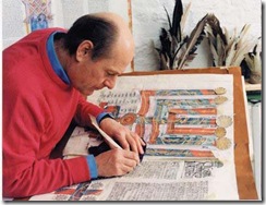
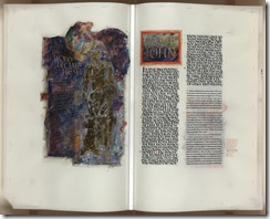
When I first read the theme, I immediately thought of the St. John's Bible. I read about it years ago when the project first began. In 1998, St. John's University in MN commissioned former calligraphy to the queen Donald Jackson to illuminate and hand write the bible. They have created a fully comprehensive and completely inspiring website which describes the whole process.

illum3

Donald Jackson and his assistants did tons of study and research. They used hand made inks and hand ground pigments. They invited school children to illuminate their own favorite passages.

illu2

They thought carefully about the mission, the history, the vision, the tradition and the translation.

st-john-bible[1]

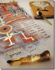
They created spectacularly dramatic images and used beautiful gold leaf.

illumination

I'm not exactly sure what my quilt will look like, but it will incorporate letters and something metallic!

Wednesday, June 11, 2008

My other illuminating thought

Deborah asked what my hokey idea was, so in the spirit of sharing and encouragement I've decided to bite the bullet and post it. I also wanted to try a little blog cross pollination since my once creative blog is now languishing in banal posts about moving. So, come on over and read what this is about:

Tuesday, June 10, 2008

Illumination Ideas


Sunrise on the Sea of Galilee

Kristin asked about other ideas for this challenge. I would love to abstract something like this sunrise. I did not take this photo, my friend David, who is a professional and has an awesome camera, took it. I just love it.

I also have photos of sun dappled trees which inspire me.

Saturday, June 7, 2008

Thoughts on Illumination

Immediately after reading Brenda's announcement of "Illumination" as our next theme, the graphic designer in me thought of illuminated manuscripts, and both "The Book of Kells" and medieval Books of Days or Hours in particular (I could loose hours reading and looking at everything on the Colophon's site).


(via About.com)

As the medium is the message (a defining concept for me), I had to find a way to tie egg tempera and parchment to thread and fabric. It dawned on me this morning that embroidered monograms could have a possible connection, often being highly decorated letters themselves. In looking for historical monograms online, I ran across a Brintannica article on the "Sacred Monogram" referencing none other than The Book of Kells. The most famous sacred monogram, is of course, the Chi-Rho; the first two letters of the Greek word for Christ, often with the alpha and omega of the apocalypse on either side. By the way, it's the Chi-Rho that's been simplified to the X we now use in Xmas. Anyways, the sacred monogram angle connected the stitched letter back to vestments and to bibles, which are the original illuminated manuscripts.

So, what I thought was a dead-end idea last night, might actually have some merit. I found some exquisite examples here, and letters here. I have another idea too, but I'm worried it might be too hokey.

Wednesday, June 4, 2008

Artist Gallery Pages Now Updated

Twelve by Twelve ArtistsThe Artist Gallery pages of the Twelve by Twelve website have been updated. Each artist now has their very own page displaying the challenge quilts that they have created so far.

While many of us are using this challenge as an opportunity to experiment with different techniques, the distinctive style of each artist is quite apparent when you see their quilts grouped together.

Click on the mosaic to link through to the Artist Gallery.

Monday, June 2, 2008

Illumination(s)

Every Autumn, in order to extend the tourist season in Blackpool ( a dingy, out of date resort on the North West coast of England) The Illuminations are held. Six miles of lights are strung along the coast roads which include the Golden Mile - a strip of Bingo Halls, rock shops and Amusement Arcades. Street vendors sell Kiss Me Quick hats, sugar dummies and flurescent plastic chokers.There is only one way to take this and that is with gusto. Ignore the peeling paint of the dated guesthouses and the worrying tattoo parlours. Abandon any finesse you may posess and go for it with gusto.
My advice is to park at the North End in rather more decent Cleveleys and start with ginormous portions of fish and chips and traditional puddings at Cleveley's Cafe. Then, jump on one of the creaking trams ( illuminated naturally, in the shape of a spaceship perhaps) down to the Funfair. Watch other people making themselves sick on the rides then, grabbing a stick of candyfloss for sustenence, walk it all off by beating the crawling travel with an on-foot meander through the tack and neon. And who says Northerners have no class?

Sunday, June 1, 2008

Friends

Don't forget to check out the friends of Twelve by twelve, they are all awsome, including Art for 12 which is in a language I don't understand, but I quickly figured out the challange was about eyes!

Splash! Water Gallery is now online

I have now loaded the water-themed quilts onto the website Theme Gallery (updating the artist gallery pages could take a little longer):

Once again, I am fascinated at how a cohesive mosaic and palette emerges from twelve individual pieces and how the the group "quilt" is greater than the sum of its parts. Despite your comment on my post Gerrie, your rainbow and faded (diluted?) landscape fits right in.

A Light Bulb Moment

From the outset of this collaborative art quilt project, I have been collecting theme ideas waiting for this day! Themes so far have been botanical (dandelion), gastronomical (chocolate), sociological (community) and elemental (water) but that left me plenty of scope.

After we've all had a turn at choosing the theme (you have a long wait Terry!), it would be interesting to compare our respective short lists. Certainly, I had no shortage of ideas but I was still feeling a little anxious about choosing the "right" one to run with that had not been used excessively before*. Then, in a flash of inspiration, I had a new word and our next theme:
Illumination:
  1. (a) The act of illuminating or (b) The state of being illuminated.
  2. A source of light.
  3. Decorative lighting.
  4. Spiritual or intellectual enlightenment.
  5. Clarification; elucidation.
  6. (a) The art or act of decorating a text, page, or initial letter with ornamental designs, miniatures, or lettering or (b) An example of this art.
  7. Physics The luminous flux per unit area at any point on a surface exposed to incident light. Also called illuminance .
In keeping with this word, I hope you will shed some light on your creative process by blogging as much as you feel comfortable with (short of the final piece) as you explore this theme. The next due date is Friday 1 August (California/blog time).

* My anxiety was not entirely misplaced. "Stories" was high on my short list and I see that it is also the Take it Further Challenge for June.

Music From Across the Water


I so enjoyed making this water piece!

My goal was to convey a sense of water that wasn't blue. I found myself thinking about reflections in water, and the wonderful ripply lines.

And then I found a stunning photograph by Flickr friend Russell Docksteader. You can see Russell's "Water Music" photograph here. (He has a lot of stunning water reflection pictures on his photostream, in case you want to cruise.) With Russell's permission, I translated the image into fabric for my piece.

I did this as a whole cloth piece, painting the colors with Tsukineko inks. Then I machine quilted it. I studied Robin Ferrier's facing/corner triangle method and used that on the back -- it was easy and worked great!

Karen, you picked a great topic. This had a great range of possibilities and I really enjoyed it.

Rainbows and Sun Breaks

Life in Portland, Oregon means that for much of the year, rain is a predominant factor. So, for me, it was an easy jump from the water theme to think about Portland weather.

I once lived in Wilmington, NC and it was interesting to note that the annual rainfall was about the same. However, in Wilmington it pours buckets of rain from huge thunderstorms and occasional hurricanes.

In Portland, we have gentle, misty rain with occasional sun breaks and rainbows. So this became my theme.


Here is a detail:

I found a copyright free rainbow photo and fiddled with it in Photoshop and printed it on cotton. I then printed it on organza, but really faded the photo so that it was barely visible.

I cut the organza in strips and fused them to the background photo. I over lapped the strips and did not line up exactly with the background photo so as to give the impression of looking through misty rain. I left two parts of the background without the organza overlay — these were to be the sun breaks. I quilted rain and sun streaks. I had to add a border and a binding. I didn't want that to be too boring so I added some rainbow fabric to the binding.

Because of my trip during the month of May, I had to select a format that I could easily do with the time I had before the trip and the short time when I returned. You can read more of the saga of creating this quilt on my blog.

The Creek

Our new, to us, house has a creek running through the property. As we have worked on renovating the house through the winter and spring I have watched it rise and fall and listened to the peaceful sound it makes as it burbles along. It is hypnotizing to stand on the little bridge and look down and watch how it swirls past the rocks and carries leaves and bits along. The curves it moves in are graceful and graphic and those are what drew my attention and I decided to focus on.

I started with a piece of hand-dyed fabric that I discharged the reflective "sparkles" from, using powdered dishwashing detergent. I then painted in the green shades and other blues. It was fused to a dark blue background to create the lines. The rocks started as a particularly hideous commercial print that I overpainted. I considered putting a frog or dragonfly on the rocks. I thought about floating a few leaves in the water. In the end I decided it was all about the water and the pattern it made and let the design stand.

PS I don't use blue much. I don't care for blue particularly, but I have really loved working on this very blue piece of work!

Ocean Dreaming


Water, Water, Water. My mind always goes to vast expanses of water. I never linger on a simple glass of water, a sink full, or even a stream flowing from the garden hose. Maybe those all fall too close to the everyday tasks of caring for kids and home. Maybe its because I grew up with a view of the Puget Sound and spent many vacation on the Washington coast. Maybe its because my first married home was sailboat. Maybe its because I dream of leisurely days walking on the beach and gazing at the ocean, waves crashing on the beach.
I love the ocean. It is so alive with winter storms and glistening sunshine. The perfect place for quiet reflection and adventurous exploration. Its vastness quickly brings perspective to life's troubles. Okay, you can easily tell I hold a romantic notion of the ocean. I haven't experienced its potential for devastation. But that is part of the dream, of holding onto an idea that brings peace in times of stress. In my mind's eye the ocean will always represent Hope.
I created this quilt by first grabbing white muslin and paints. I have yet to experiment with hand dying, but acrylic paints are an easy was to cheat. I painted the fabric with a combination of every blue I have, with a few greens mixed in. For the darker colors I used the paints full strength. For the lighter colors I added more water. I then bunched up the fabrics and set them outside to dry. All the creases and folds add to the texture as the paints dry. The pigments travel to the top of the pile as the water evaporates.
When the fabric were dry and ironed I attacked them with free motion quilting. I used three shades of metallic blue thread to add the sparkle. I pieced the quilt by overlapping the quilted fabrics and cutting with the rotary cutter. I then attached them with a wide zigzag and silver thread. This was the first time I have worked with curved pieces. They came together rather easy.
I auditioned various embellishments on this piece. They were too cute or distracting. In the end I left the quilt simple -- a truer reflection of the picture in my minds eye.

On top of the World

After having picked the theme water, I had the hardest ime coming up with an idea. I was distracted by my daughters wedding and a trip to Mendocino. I looked thru my photos from the various travels and settled on this picture I took at Lake Titticaca in Peru/Bolivia (back to the realism). I quilted white silk/cotton fabric, then painted in the features, which is a technique I've only played around with once before. The hand stitching is the reeds that grow up in huge areas of the lake, and which the people that live on the lake make thier floating islands from. I left out the women that use these boats, wearing thier gorgeous colorful clothing, I knew I couldn't pull that image off!

Firmament

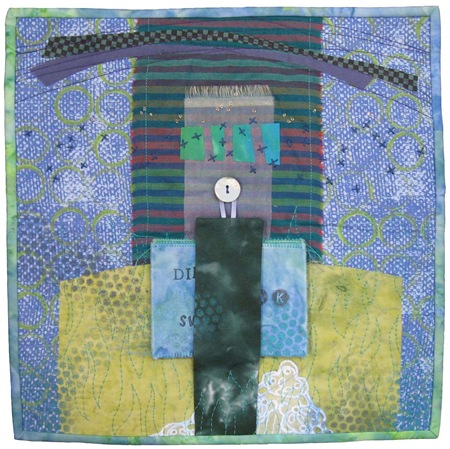
My piece took several unexpected turns. The process was a bit disconnected and I think there are several ideas here which come together in a somewhat cohesive quilt, but it would be interesting to explore them on their own.

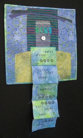
I began by gathering fabrics and I made some sketches. I've been intrigued by book arts lately and I thought I'd incorporate that in some way.

 water clean

I created a simple accordion book with two layers of fused fabrics. I cut each page separately and stamped various words on the pages. I brainstormed things that you might do with water and I just kept stamping the words until I ran out of ideas. Then I zigzagged the pages together and pressed them into an accordion format.

water unbound 

I used sequin waste as a stencil and painted the circles onto the surface of the book (and the rest of the quilt).

Originally, I was thinking of creating an abstract landscape inspired by my parents home on Lake Ontario. I even asked my dad to collect some smooth stones from the shore and bring them when they visited last month. The book concept took me a little away from the landscape.

But as the piece was in progress on my design wall I began to see some of the landscape elements I had originally sketched. The lacy bit on the bottom is a bit like foamy waves on the shore.

water closeup

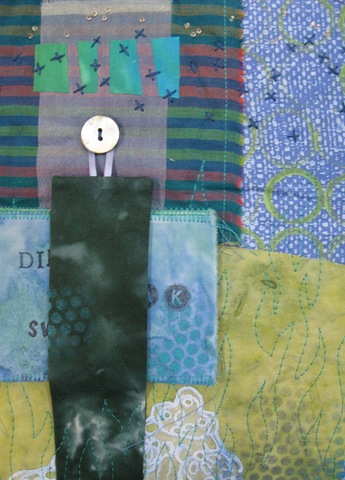
The striped fabric really makes me think of a sunset with just those few lines of orangy red mixed among all those watery cool colors.. The embroidered x's and the tiny seed beads at the top could be sky and stars. The arch could be a firmament.

That made me think of the familiar words from the creation story in the Book of Genesis.

God said, "Let there be a firmament in the midst of the waters, and let it divide the waters from the waters. And God made the firmament, and divided the waters which were under the firmament from the waters which were above the firmament: and it was so. And God called the firmament Heaven. And the evening and the morning were the second day.

Then I wished I would have done a piece all based on that bit of scripture. (Maybe I'll do that for the Quiltart Journal project. Participants are required to make a quilt based on one or more of the elements: earth, air, water, fire.)

I like the composition of the quilt. I've made several other quilts with that altar/shrine format. I also really like the variety of textures, fabrics and surface design. I think the book is cool, though I'm not completely sure it fits.

Splish Splash


As I stated earlier in a blog post here, I've always loved images of mermaids and wanted to someday create one. Well you also saw in that post my initial drawings and I must say I really enjoyed creating this quilt and adding the embellishments.

I have been a fan of Nellie from the Nellie's Needles blog for a long time. She creates awesome water (lake series) quilts, and while I don't exactly know how she creates her quilts, I tried mimicking the look to create my water. I dyed white on white fabric for the skin using fabric paints. I drew her facial features on with a marker and then added further color with Tsukineko inks and fabric markers.

I embellished her lower body with sequins and beads and they really look great in the right lighting. I added teardrop-shaped beads to give the look of water spraying from her tail. I had the most trouble with her hair. I, at first, thought I'd create it with just yarns/fibers, but I wasn't happy with the control over the placement of them, so I sketched out some shapes for fabric and then added some fibers to enhance it once the fabric was stitched down.

I have created all of my 12x12 quilts on heavy interfacing, like Timtex, as I like the support it offers on these small quilts. I have also zigzagged around the edges of all my 12x12 quilts and on this particular quilt, I also added a fiber around the edge.

Water: Sustainer and Destroyer

This one is all about the concept. Life cannot exist without water, yet water has the power to destroy as well.


I could have gone for dramatic imagery, but instead, I chose to keep the imagery rather generic but rather to create this quilt (or more properly, assemblage) out of things that are affected by water. Of course, since we are an art quilt group, the things are all related to sewing.


The "top" is appliqued with circles of sheer fabrics, to include a stabilizer painted in a water ring pattern with water soluble paints. It is embellished with pearls glued on with basting glue that releases when wet. I colored the piece with water color pencils and a fabric marker that disappears when wet. The "batting" is water soluble stabilizer.


The quilting is done with water soluble thread on top and a variegated rayon thread in the bobbin.

(Because of the sheer fabrics, I think this looks especially nice backlit.)


The backing fabric is a silk scarf which I marbled -- a process that requires paint to be floated on water.

This is what the piece looks like now, representing the sustaining quality of water. But eventually, I'm pretty sure I'll need to douse it in water and document it's demise to show the destructive power. I'm thinking that I should wait until it has a chance to travel across two oceans and then I'll photograph it at the beach, or perhaps find a waterfall which can be part of the process of destroying the piece. Performance art. Who knew we'd go there.

What would you like to see?

Swimming pool reflections

I cannot guarantee that the inspiration for this quilt is unique but I suspect there are not many art quilts out there that represent a Unisex toilet door! It may also be one of those inspirations that should have inspired but not actually gone in the quilt ... but, too late now!! My previous post mentioned my swimming experience and I decided to go with my impressions of the reflections on the moving surface of the water.As with the other quilts in this challenge I decided to use techniques I had either never done before or only done once and hadn't done to my satisfaction before. So for this one I used stamping with fabric paint using the back of a Sherrill Khan stamp that just happened to be the first thing my hand rested on! It came out much better than the lettering on my Community quilt. That represents the mosaic floor of the pool. Hand seed stitching represents the 'scratchy' marks on the water that came from the bare tree branches outside the window.I painted the wavy reflection of the door of the aforementioned Unisex Pool toilet door, and then tried to disguse my heavy hand with the paint by quilting narrow lines over it with varigated thread. (Following my self imposed rule above I may well have to paint on the next quilt before I can move on from that technique! Brenda - is there any chance your next theme will be Kindergarten art?!) Over the whole lot I machine quilted the grid formed by the tiles of the pool wall and added 'slubs' of close quilting and small beads to show the glittery shimmers on the surface of the water.
Finally, I finished it with Terry Grant's method of couching perle thread to the edge of the quilt, except that I had already trimmed it to size before I read her instructions not to do so until after the couching, and except that I didn't have perle thread so I used embroidery thread, so the state of it should not be taken as any reflection ( pun not intended) on the quality of her tutorial.

Overall I am content with this quilt, though, as being a move forward for me from strictly representional to impressionalist/ abstract. The edges remain a little wavy but,if that is not allowed with this quilt, when will it ever be?!

Droplets

This is "Droplets", my 12x12 water quilt. I took a picture of dew droplets some time ago in my garden. I liked it so much that I played a lot with it on the computer. For this quilt, the manipulated image was printed on banana paper. I then bonded the paper on homedyed blue green fabric. The background fabric is also homedyed. I added a few silvery beads, because they made me think of tiny droplets.
Here's a detail of the quilt...
More pictures on my blog very soon...

Down the Plughole

For this challenge, I wanted to do something quite different from the first 12in square water-themed quilt that I made sometime ago and I had plenty of ideas.

I had fun experimenting again with shibori to create various "water" fabrics as shown on my blog. I even started quilting one of the pieces. I quite like it but the overall effect is very subtle and I decided that something stronger was required as part of a group mosaic. (Is anyone else is finding that their design decisions are being influenced by this factor? I don't think it is a bad thing and the mosaics so far have been greater than the sum of their parts.)

Out of deference to my husband (aka the Laundry King), when I am dyeing fabrics in low volumes, I rinse the fabrics by hand rather than in the washing machine. Thus I observed lots of turquoise water disappearing down the plughole. This reinforced my decision to concentrate on this quilt.
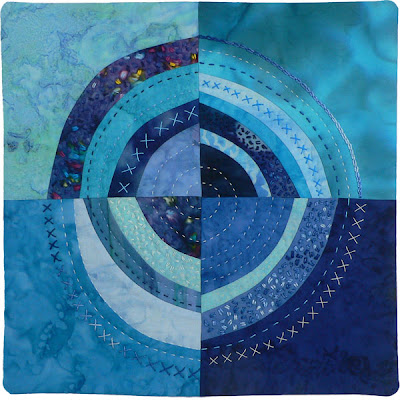
Coriolis by Brenda Gael Smith
Coriolis
This is my tribute to the enduring myth that water goes down the plughole in a different direction depending which hemisphere you are in. (The coriolis force is real but is noticeable only for large-scale motions such as winds.)

I used freehand rotary cutting for the piecing and hand quilted it with a variety of perle threads in different weights and colours. I finished it off with a mitred facing (see the tutorial on my blog).

New World

For two years now I have been taking photos of water and collecting them. I don't know why, other than that I love water and I am constantly surprised by the variation in colour that I see.
Water
As soon as our challenge was revealed to be "Water" I knew that I would use my photos. At first I thought they would just be references and I planned to make a quilt that was just an image of water made up of layers of applique. Then Terry had her article published in Quilting Arts and I bought the magazine and opened it to see... the exact thing I planned to make, already made by someone else! Poo.

The last month has been a very busy and stressful one for me and my husband (we have a new business) and, as the month passed, I found myself delaying work on the quilt and only giving it minutes of thought here and there. But those minutes added up and eventually I had a plan - to make a quilt about water using only photos of real water. I printed seven of my photos on to inkjet printable poplin (because at $8 a sheet that was as much printable fabric as I was prepared to buy!!). It was not easy to choose which of the photos to use and I realised as soon as I saw the first print that the colours were very subdued and I wasn't going to get any intensity. At that point I went all Zen and decided that whatever the printer gave me was what I would use. I didn't have the time or resources to play around!

My favourite of the photos (the brilliant turquoise) was taken on a trip to The Barrier Reef last year when my daughter had her first scuba dive. This quilt would be about that experience. She was so excited that day. I have rarely seen my reserved and cool daughter so openly bubbling and fizzing!
New World

Although I have a passion for saturated and intense colour, the printed fabrics were so quiet that I figured I wouldn't be able to fight that and would have to work with it. So the intention became to have a quiet image of Ali emerging from the blue.

I made a line drawing of Ali and then used fusible web to make the image from my printed fabrics. I only used these fabrics (although I was very tempted to use others!) There is a small amount of stitching on the raw-edge applique to enhance some of the shapes, but mostly it is not stitched. The quilt is quilted in horizontal wavy lines using threads in soft blues, aquas and green. I also added some coloured pencil to adjust the colour of her face -it was too green- and shade her eyes a little. It's very hard for me to stop once I start drawing on things, so it took a lot of self-control not to completely rework the image.

I am probably the least satisfied with this quilt of any that I've made for 12x12 so far. I like the idea and the sewing went well. I am bothered by the darkest of the fabrics and wish I'd used something else. With such a limited choice of fabrics and no chance of making more (self-imposed) I guess I was up against it. Interestingly, this quilt looks best up close and really looks awful at a distance - most of mine are the other way around!!

I still like the idea of a water quilt made with water photos, but I think I could have done much better. I decided at the start of this group that I wouldn't beat myself up about these quilts; that I would use the format to experiment and have fun. It's working. I am!

There are a couple more detail shots on my blog.